
Custom Search
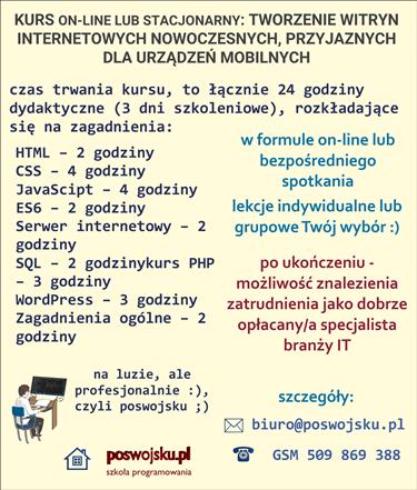
CENA - OFERTA: Jesteś zainteresowany/na kursem – zapraszam do kontaktu ze mną, szczegóły: www.poswojsku.pl .

What can you put on the website? Virtually almost everything that is necessary for the transmission and exchange of information, namely:
navigation systems,
texts
pictures,
sounds
animations,
various applications,
on-line information exchange systems such as: chat, forum, etc.
You already know the following website code:
<! Doctype html>
<html>
<head>
<meta charset = "UTF-8">
<title> Designing and creating responsive websites </title>
</head>
<body>
<p > WEBSITE CONTENT </p>
</body>
</html>
Now learn - in the next section - explanations about the structure of the web document
Each website must contain at least the following four elements:
The first line of the webpage's code contains the document type declaration.
<! doctype html>
<html> - the marker appears only once at the very beginning of the page and closes </html> (with a slash) at the end of the page. Informs the browser that the content contained in this document is presented using HTML. Other elements are inside.
The next element is the header - <head> - contains the title of the page (e.g. Designing and creating responsive websites), as well as many other information that is used by search engines and browsers. These include information - links - pointing to attached sheets, for example cascading style sheets or JavaScript files.
We come to what is displayed on the website - website content. It is surrounded by <body> tags and contains information that appears in the browser window: headers, navigation systems, text, pictures, animations, etc.
Remember to close each tag!
HTML5 MARKER: HEADER
HTML5 MARKER: NAV
HTML5 MARKER: FOOTER
HTML5 MARKER: I: ARTICLE, SECTION I DIV
HTML5 MARKER: ASIDE
HTML5 MARKER: p
HTML5 MARKER: h
HTML5 MARKER: li
HTML5 MARKER: ol
HTML5 MARKER: br
HTML5 MARKER: img
Description of tags can be found in the next part of the guide on creating responsive mobile websites.
Do you want to advertise on postwojsku- go ahead! Write to us
mail: marketing poswojsku.eu
We do not currently provide any paid online training. Only stationary training .
www.gddm.com.pl Zduńska Wola, Paprocka 86, GSM 794 553 153, RODO training - from 290 PLN, RODO consulting - from 290 PLN
 After hours: a dog from a shelter or a dog from a kennel ? ..

TWORZENIE STRON WWW KSIĘGOWOŚĆ ZARZĄDZANIE MARKETING GRAFIKA PROMOCJA DOTACJE UE ZARZĄDZANIE PROJEKTAMI PORADNIKI
© 2011 - 2024 by poswojsku sp. z o.o. - Digital Publishing poswojsku, informacje o portalach poswojsku :), kontakt: mail: marketingposwojsku.pl