
Custom Search
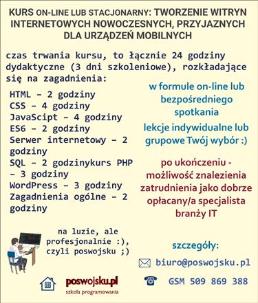
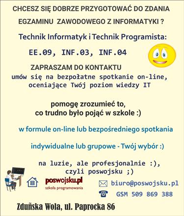
CENA - OFERTA: Jesteś zainteresowany/na kursem – zapraszam do kontaktu ze mną, szczegóły: www.poswojsku.pl .

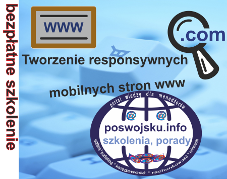
is a solution that allows you to build a site that automatically adapts to devices of various dimensions. This means that the responsive website will be readable and convenient for viewing for both owners of small screens - e.g. smartphones and large users, e.g. several dozen-inch monitors.
Imagine a four-column side. Viewing it on a phone with a display with a width of 320 or even 640 pixels will be very inconvenient. On the other hand, on a large monitor (e.g. 2560 pixels) text in one extended column would be read badly. And here we come to the RWD techniques - i.e. creating:
Thanks to RWD it is possible to change the appearance of the page based on the width of the browser window and / or other factors. So for each type of device you can provide content in a readable form without the need to create multiple versions of the site. RWD is a whole set of solutions based on HTML, CSS and sometimes JavaScript (or more precisely JS frameworks - e.g. Modernizer), allowing you to build pages with layouts that automatically adapt to different screens.
The flexible mesh means that fixed width systems are not used. Mobile devices have displays of various sizes, so there is no point in setting a specific page width. It's better to make the site grow or shrink depending on the amount of space available. This is the idea of fluid systems. One of the most interesting solutions is the solution grid called Bootstrap.
Bootstrap is the perfect tool to create a responsive website. Its advantage is very high flexibility and not too complicated construction and operation, even for beginner webmasters who want to create responsive websites. Examples of responsive websites can be found at: poswojsku.eu .
The use of flexible media means that images and films adjust to the size of the screen of the device on which the website is displayed. The effect is to display large photos on large monitors, and small ones on small displays of mobile devices.
Media queries is a CSS technique that allows you to send different styles to your browser depending on current conditions. This means that we can send a completely different set of styles to a device with a small display than to a large desktop computer screen.


We cordially invite you: poswojsku.eu
Chcesz zareklamować się na poswojsku- śmiało! napisz do nas
mail: marketing poswojsku.eu
Obecnie 2023 nie prowadzimy żadnych szkoleń płatnych on-line. Ale możesz się zapisać na super fajne :) szkolenia stacjonarne - zerknij na wykaz na naszej oficjalnej stronie www.poswojsku.pl

TWORZENIE STRON WWW KSIĘGOWOŚĆ ZARZĄDZANIE MARKETING GRAFIKA PROMOCJA DOTACJE UE ZARZĄDZANIE PROJEKTAMI PORADNIKI
© 2011 - 2024 by poswojsku sp. z o.o. - Digital Publishing poswojsku, informacje o portalach poswojsku :), kontakt: mail: marketingposwojsku.pl