
Custom Search
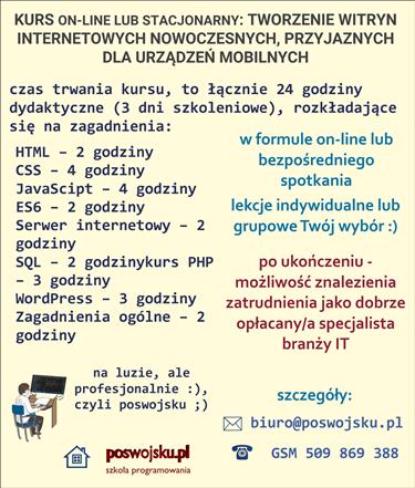
CENA - OFERTA: Jesteś zainteresowany/na kursem – zapraszam do kontaktu ze mną, szczegóły: www.poswojsku.pl .

The philosophy of building a website in HTML5 + CSS technology - consists in building the page structure in an html document, and then formatting how to display individual elements in a CSS style file, remembering the three principles mentioned above:
1. flexible mesh as the basis of the system,
2. flexible codes for displaying media - for: images, films and even embedded ads,
3. CSS media queries to provide different style sheets for screens of different widths.

Analyze the following CSS codes - they make the grid, i.e. the entire website, responsive - they decrease proportionally as the screen on which they are displayed decreases.
nav ul, header h1, footer p,. content-class {
max-width: 1200px;
margin: 0 car;
}
header {
padding: 2.3em 0 1em 0;
width: 85%;
margin: auto;
border-radius: 30% 30% 15% 15%;
background: #111E50;
}
.kontener-glowny {
float: left;
width: 100%;
border-left: groove 1px #012359;
}
.main {
float: left;
width: 70%;
padding: 0 20px;
border-right: groove 1px #012359;
}
.kolumna2 {
float: right;
width: 30%;
padding: 0 10px 0 20px;
border-right: groove 1px #012359;
font-size: 1.05em;
}
Additional examples of flexible dimensions:
ul li {
font-size: 80%;
}
Analyze the following CSS codes - they cause the media - here the images are displayed flexibly - they decrease proportionally as the screen on which they are displayed decreases.
img {
max-width: 100%;
border-radius: 5%;
padding: 2%;
}
QUESTIONS ABOUT CSS MEDIA FOR PROVIDING DIFFERENT STYLE SHEETS FOR DIFFERENT WIDTHS
Analyze the following CSS codes - they cause that the page size is displayed properly on a given screen of a given size.
The screen on which the page is displayed has a maximum of 640 pixels, the page is displayed with css codes contained in the mobile.css file, and when the screen size is at least 641 pixels, styles from the styles.css file are downloaded.
<meta name="viewport" content="initial-scale=10">
<link rel="stylesheet" type="text/css" href="//www.poswojsku.info/android.css" media="only screen and (max-width: 640px)" />
<link rel="stylesheet" type="text/css" href="//www.poswojsku.info/styles.css" media="screen and (min-width: 641px)" />
Chcesz zareklamować się na poswojsku- śmiało! napisz do nas
mail: marketing poswojsku.eu
Obecnie 2023 nie prowadzimy żadnych szkoleń płatnych on-line. Ale możesz się zapisać na super fajne :) szkolenia stacjonarne - zerknij na wykaz na naszej oficjalnej stronie www.poswojsku.pl

TWORZENIE STRON WWW KSIĘGOWOŚĆ ZARZĄDZANIE MARKETING GRAFIKA PROMOCJA DOTACJE UE ZARZĄDZANIE PROJEKTAMI PORADNIKI
© 2011 - 2024 by poswojsku sp. z o.o. - Digital Publishing poswojsku, informacje o portalach poswojsku :), kontakt: mail: marketingposwojsku.pl